
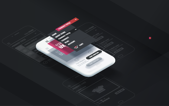
Before we get started, let’s break down what UI, or user interface, is for those who may not know. UI is not just pretty icons or buttons alone. UI also includes all interactions by the user with the system, for example, the description of the functionality of a label or icon, how information is provided to the user, or how the user is allowed to perform an action. For instance, if you want to send money to a friend that lives across the country, you may use an app like Venmo. Often, similar apps have a highly suggestive UI button that encourages the user to perform the action of sending money without explicitly saying, “Press this button in order to send money,” as exhibited in the examples below. The UI button communicates the message in a more colorful, stylized way to place emphasis on the action users should take. These intentional messages help dictate the way in which a user should engage with the website or system, thereby, creating seamless user experiences. Of course, minimalistic or less verbose UI has to be balanced with search engine optimization and accessibility. Search engines have to find this information as part of search results, and users with a wide range of disabilities need to use the website or mobile application.

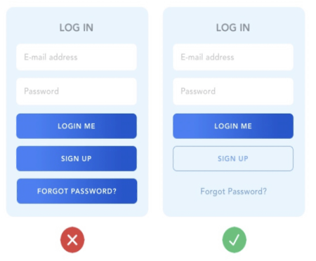
Good UI also helps invoke a call to action through elements such as contrast, color, and font size. As the variation in tone enhances the quality of communication in a conversation, UI elements must also do the same. If all UI elements are monotonous, then the action requiring emphasis can get buried alongside other information leaving a user without clarity in making the most efficient decision. As illustrated in the example below, if a user wants to use an app that requires logging in credentials quickly, having all of the buttons in the same color and font size can cause slower reaction time; whereas, altering the appearance to place emphasis on some over others provides greater distinction and clarity. While there are no right and wrong answers, there are best practices that can be used as shown in the Figure below.
In addition to emphasizing various elements, feedback is also important for good UI. The main goal of feedback is to engage with users to communicate information. For example, when a user clicks a button, the color of the button might change completely or the outline of a UI button may be highlighted or show a different color. Just as a good listener takes in information and gives back engaging feedback to the speaker, a good UI should do the same. Recognizing that the UI is anticipating and aiding in the user’s decision offers a better overall user experience.
Another important factor in UI design is consistency and reusability. For a website with tens of pages, it’s important for user interactions to be consistent across the site. Similar buttons should look and act the same. Similar approaches to pagination or filtering lists should be used. On the implementation side, we benefit when UI developers build a “UI component library” and re-use it as opposed to re-inventing the wheel with new UI elements on every page.
When the UI is done well, it will typically go unnoticed. This result is not by accident but by design. When consistency, emphasis, and feedback are paired with a great layout, usage is intuitive and will positively influence each user’s experience. How consistent is the color palette of the website or mobile app? How easy is it to find a commonly used button? All these elements feed into intuition and play a part in having good UI today.
Artemis Consulting utilizes the most current UI best practices and trends to design intuitive solutions for our clients. Our UX Playbook provides a step-by-step road map for the entire UX process to assist you in providing an optimal user experience.