
Are you updating a website but are having trouble understanding the reasoning behind the graphic designer’s recommendations? This blog gives you some current trends to keep in mind and could explain where your graphic designer is coming from.
In today’s busy technology age, we often overlook all of the details that go in to creating the visual elements we see in front of us. From the icons we tap on our smart phones, to the entire look and feel of our favorite websites. It’s easy to see the contrast when you compare a website that was built in the last year versus one that was built in the late 90’s. But even from year to year, visual design is constantly evolving into more eye-catching creations. These changes come partially due to the pace of change in technology and partially due to companies’ desire to be different and try out new looks. We are learning over time that attention spans are becoming shorter, as people expect things more quickly and that are even easier to use. Companies are working harder and harder to convince buyers, as quickly as possible, why they should look into their services or products instead of those of the competition.
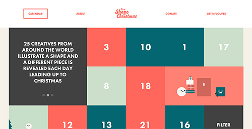
One trend involves less use of gradients, drop shadows, outlines, etc. More of a “flat design” is being utilized. This uses more of a minimalist approach to draw more attention to the subject(s) in the design. Elements are separated by just simple lines, simple shapes, and contrasting colors. A great example of this would be http://itsashapechristmas.co.uk/. Another example we see every day, the icons for the applications on our phones. Most have a two dimensional look with simple shapes and the use of bold colors.
We are also seeing the use of the entire screen on websites. In the past, the content of a website would be centered in a column in the middle of the screen. This technique takes advantage of the entire space that might be seen by potential customers or clients. Popular examples of the new trend are the Spotify website and the Apple website. There is a limited amount of scrolling and more use of buttons to jump from section to section, or Parallax scrolling. This is a popular technique used in traditional animation and video gaming.
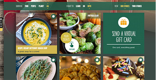
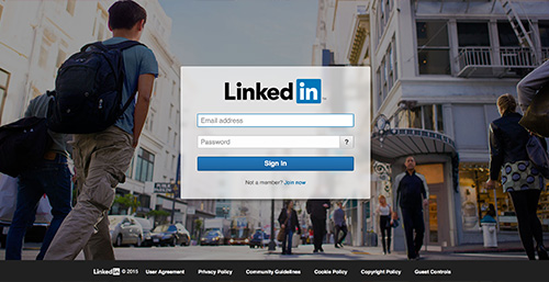
Smart phones with iOS7 have also influenced trends with the grid layout. Much of this correlated with when Pinterest came out – it started a trend. It gave users a logical and ordered way to see their search results. Both Whole Foods Market and LinkedIn’s login page utilize this approach.
Lastly, and probably one of the biggest changes we have seen within the last 5 years, is the use of Scalable Vector Graphics (SVG) over any other vector format. Check out our blog on SVGs. The sudden push for SVG over other formats has to do with its ability to scale, larger or smaller, and not lose any quality. This is great for print design. The only drawback is with IE8, where an SVG has to be complimented with an additional graphic in a different vector format or simply replaced with a responsive image to display correctly.
In a nutshell, it seems like keeping things as simple as possible is becoming a primary component of each evolution. Minimalism and sleekness is what is catching the consumer’s eye and is pushing them to finish a transaction. Check back with us in 2016! We will be blogging about how trends have changed in 2016!