Designers and users do not always see eye-to-eye about what a good user experience entails. In this blog, I am writing to fellow UX designers in a call to action.
So – let’s start with the basic question – what makes the user’s experience positive? Overall, the answer is the obvious: – a positive user experience comes from a design that is user-centered. As designers, the biggest mistake we can make is to focus on the design and how it will look like in our portfolio. To be cliché for a moment, form follows function. We all know the importance of an attractive interface, and the credibility it can bring. However, it can be the sexiest design in the world, but fail completely if the users can’t figure out how to use it or find the functional aspects difficult to use.
When the artistic side of our brains hear a new project, it immediately starts visualizing what it could look like. Stop yourself immediately because this, can never be the first step. If we go straight to the design, and then try to make that design fit the function of the interface, it will never be the most intuitive interface possible. The first step has to be understanding the task and what the users are trying to accomplish. Often times, to fully understand the user’s goals, we need to speak to the users directly. There are many different methods of doing user interviews. As long as we get a decent sample size, and are asking open, non-biased questions, we will find the answers we need. Often times the users give us insights we do not think of, especially if we aren’t in the target audience. In a way, the users can do some of the work for us. They tell us what they want, and, sometimes, they even know how their problems can be solved.
Then, without any designs, colors, or fonts in mind, we have to start thinking about the simplest path to accomplish the user’s goals. User flows are important to make sure our designs don’t leave anything out, and to make sure the path is the shortest one.
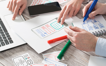
This approach allows us to start visualizing the interface and do some sketches to figure out basic layouts and see what elements will be needed. Be careful though, sketches aren’t designs, they don’t have color or specific fonts. They are just thoughts drawn on paper to help us communicate the big picture. We then take these sketches and do some early stage user testing. Without actual designs, the users are able to stay focused on functionality and whether we’ve covered all their needs instead of getting distracted with why we chose the colors or fonts that we did.
In the final step, we can start designing! Even in this step, the visual elements should be focused on the user. We might love using Helvetica, but what message and emotions does it send to our user? Do our users expect modern looking fonts or something old fashioned? Is it likely they will need bigger bolder fonts to be able to see everything clearly? Can they handle a lot of text or do they need images to break things up? What do the images communicate to the user?
By this point in the project, we should know enough about our user to know who they are and how they think. This will allow us to deliver visual elements that communicate the right messages through the design elements and functionality that does what they expect it to do. When you are struggling with the user design and experience issues, remember the steps I took you through and reach out to Artemis Consulting for more expertise.