

In this article
Overview
For all customer-facing organizations, direct communication with the general public or potential client base is the lifeblood of the enterprise. As such, it is essential for organizations to have established Style Guides that set the tone and guidelines for communicating with the public. Because these guides provide direction on standardized elements, they are critical to minimizing the risk of miscommunication.
As much as one expects for staff to be intuitive, it is important that enterprises develop brand consistency and institute cohesiveness to standardize internal and external facing visual elements. These measures avoid common problems like an organization using an outdated logo, using a logo with improper or distorted dimensions, or utilizing mismatched fonts when creating visual elements. For this reason and many others, it is extremely important to have an easy-to-understand Style Guide.
The production of an effective Style Guide is not as easy as some think. Effective style guides need to provide a good understanding of an organization’s mission, corporate style and brand image. These elements need to be self-reaffirming for Style guides to be effective in guiding communication with the public at large. In this blog, we will provide an overview of some of the essential elements for the development of a well-structured Style Guide.
Essential Elements of a Brand Style Guide
- Brand Story
- Logo Guide
- Color Palette Guide
- Imagery Guide
- Typeface Guide
- Digital Guidelines
- Print Guidelines
The Brand Story
What is a brand story?
How does the brand come to be? One can think of a brand story as the origin story of an organization, an entity or a product – an explanation of what your brand is about. Generally, the story recounts how the organization came to be, what sparked the organization’s inception and launch, the eureka moment after which all else followed. The idea is to create something that is memorable, that people will automatically associate with the organization’s brand. That story might be a word or a brief narrative. Regardless, it must ring true for an organization or individual.
What might that story be?
It could be the story of the two Steves, Jobs and Wozniak, building a new computer in Wozniak’s garage, which led to the founding of Apple, Inc. It could be the story of Larry Page and Sergey Brin, who met serendipitously when Sergei, a Russian who went to Stanford University as an undergraduate, was assigned to show prospective grad student Larry around campus. The meeting led to disagreements, which led to friendship, which led to a search engine called Backrub, later renamed for a pun on the word googol, a mathematical term that is a 1 followed by 100 zeros, and the rest is Google history. Amazon started as an idea in Jeff Bezos’ mind to build a better mousetrap, that is, a better way to sell books, and from that idea came everything.
Whatever the origin of the story, you must understand it very well in order to develop your brand. As your company grows, you will have people acting and creating on its behalf. You need to communicate your story to the public in a cohesive manner that resonates with your audience. Your logo must embody your firm’s culture. The related branding must synchronize with the story and the general tenor of your message. One cannot have a folksy message and a highly buffed and stylized visual presentation because they will clash. Consequently, one must develop guidelines that will ensure your brand is not represented in a way that could distort or damage its carefully cultivated image. A brand style guide keeps everyone up-to-date with what your brand means and how it is supposed to look.
You should incorporate your brand’s personality in explaining your organization’s mission, vision, and core values. The visual elements used should communicate your organization’s raison d’être. In other words, the essence of your organization’s brand to the public.
Below we show two examples. With Ben & Jerry’s, we see that the images and language exude fun and deliciousness, while NASA exhibits seriousness of purpose and adventure.
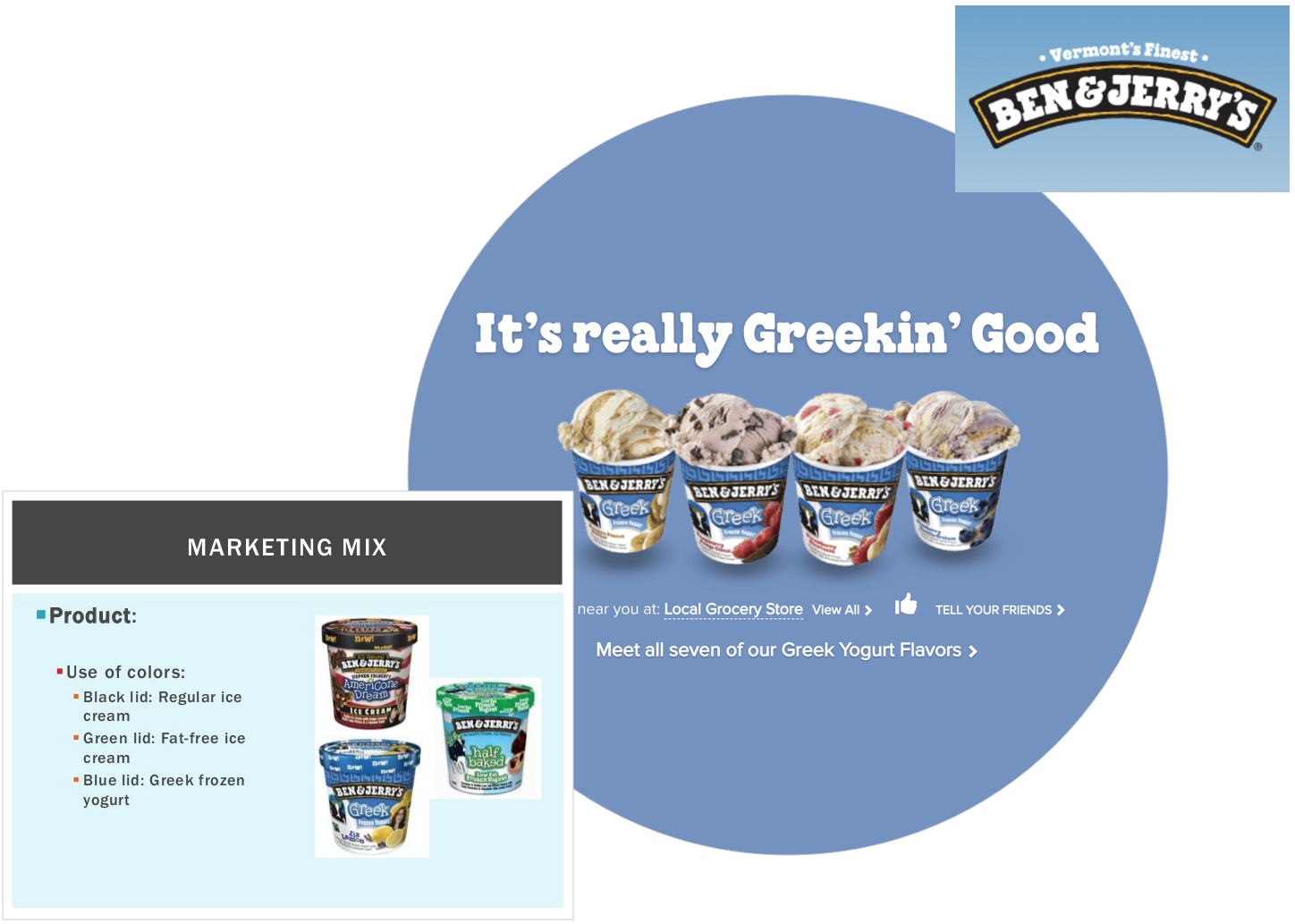
Source: Ben & Jerry’s Style Guide
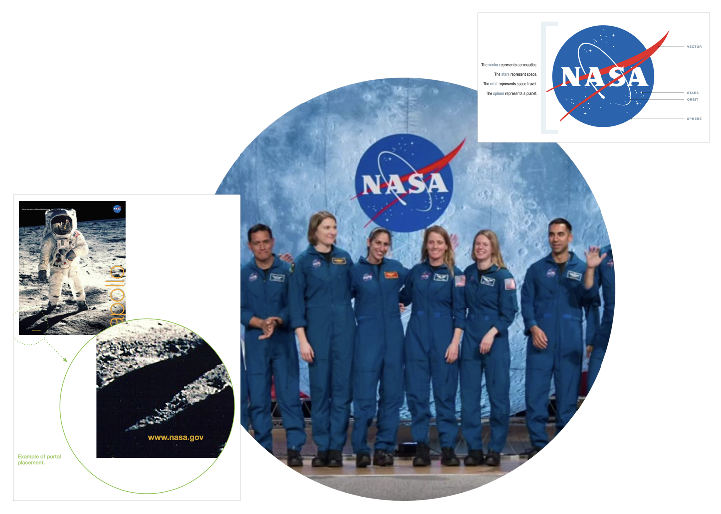
Source: NASA Style Guide
Logo Guide
To ensure consistency and instant recognizability, you must use logo guidelines. The logo is the most important part of your brand. Most everyone has seen Twitter’s logo that contains that light Twitter blue. That is not by accident. Top companies have brand style guides outlining usage rules and requirements regarding how their logos are displayed and used to limit off-message communications.
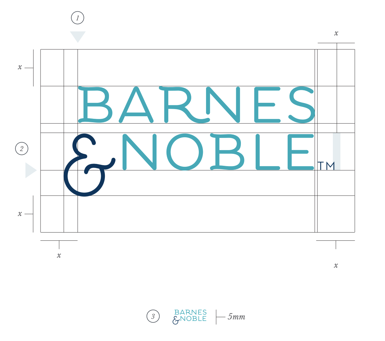
Specifications include what color variations are allowed, minimum logo size, margin space around the logos and the logo “do’s” and “don’ts.” It is critical that organizations consistently stick to these logo guidelines when they create brochures, letterhead, mobile applications, websites, and other audience-facing materials.
Source: Barnes & Noble Brand Guide
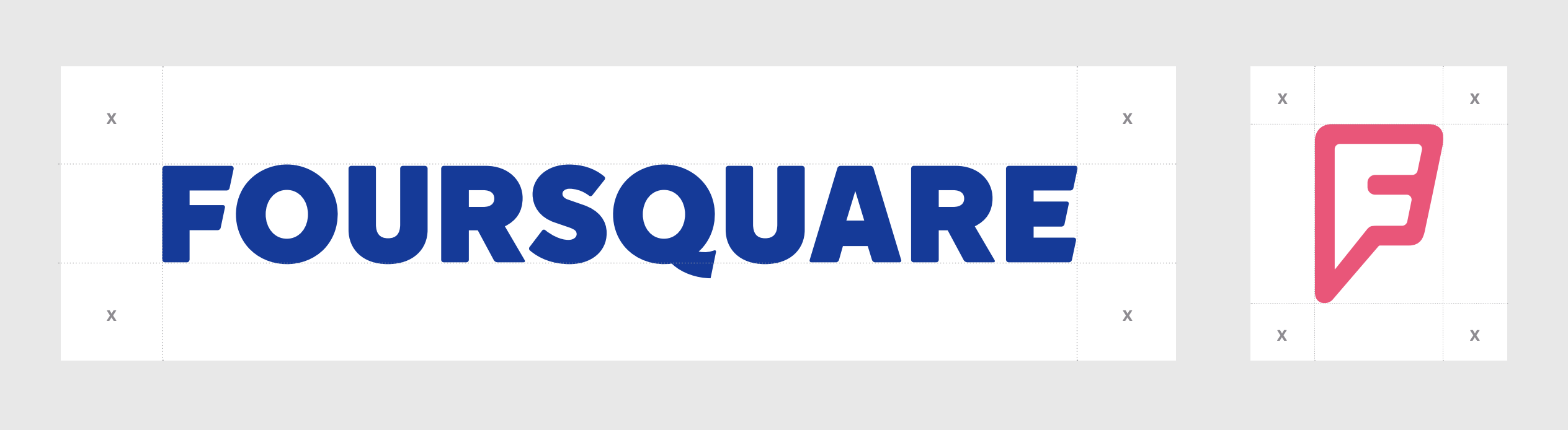
Observe how Foursquare below and Barnes & Noble above specify their logos and marks, which should always be surrounded by a minimum area of space.
Source: Foursquare Brand Guide
Concrete examples of approved colors, minimum size (and maximum if warranted), and what is forbidden is also wise. The Spotify logo information is well expressed pictorially.

The image above shows the acceptable color arrangements, no more, no less.
Color Palette Guide
In the past, brand colors were simple. A designer might have had to pick one or two colors that matched your logo, and you were all set. But in today’s world, this is no longer the case. Many companies are now using multiple color schemes to add vitality to their brand communications. To keep brand recognition intact, it’s more important than ever to develop a Color Palette Guide in your organization’s Style Guide and to make your core brand colors well known and consistent. Below is a well-known example, Netflix, which has very specific color combinations that its designers must stick with when creating visual products.
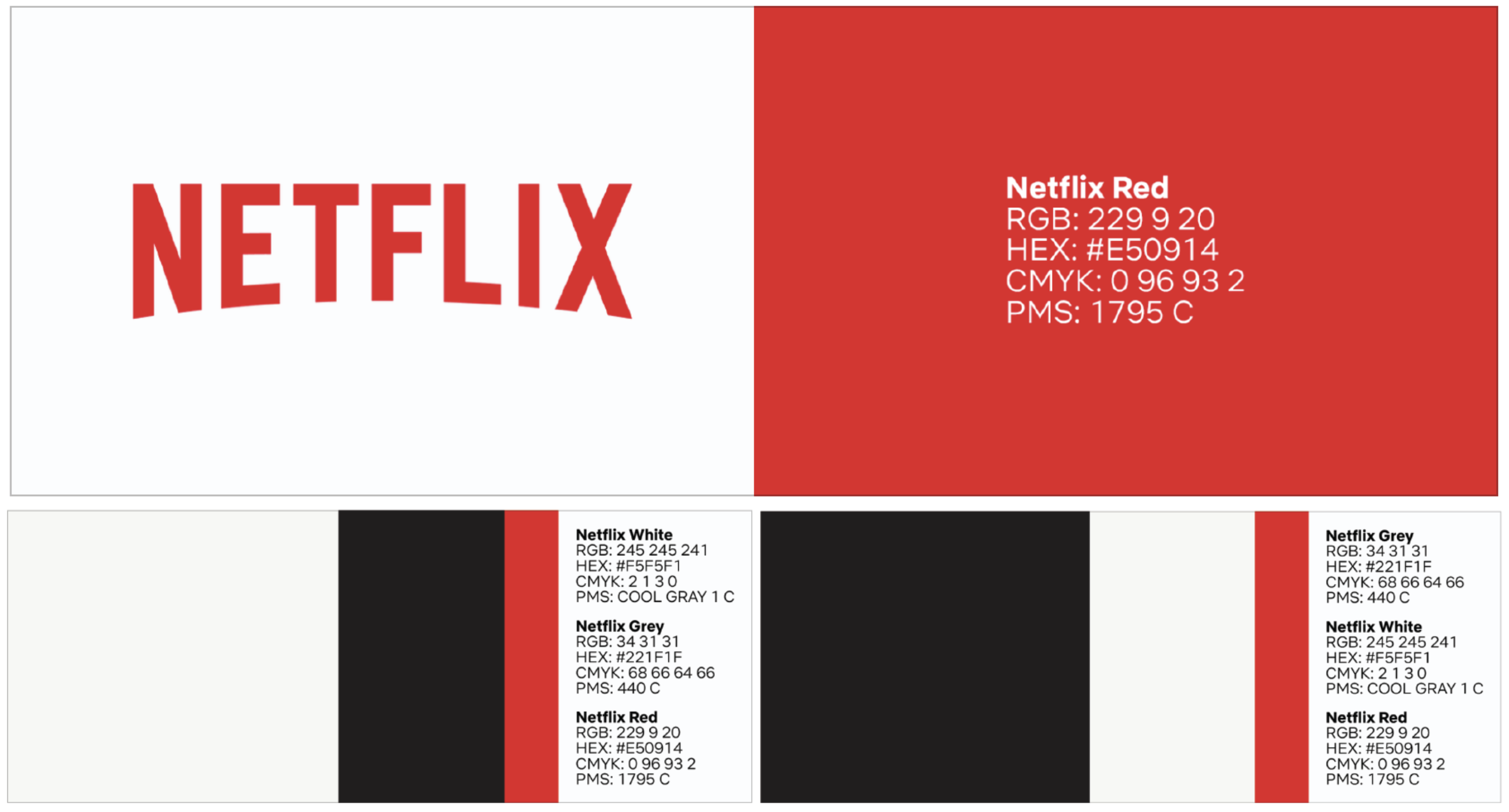
Source: Netflix Brand Assets
The color palette should define complementary colors in addition to primary colors. The color schema should cover all heading types and caption and figure notations. Unified palette across all media is recommended. If media includes the web, then color consideration should also account for color blindness. Additionally, when considering the online medium, the palette needs to account for button states and other indications of interaction, e.g. error messages, input fields and the like.
Imagery Guide
A critical consideration to make when creating a Style Guide is to decide what types of images should be acceptable. Some companies use original images or photography, some purchase stock photos or buy products from Artists, and some only use in-house illustrations. The Style Guide should communicate what type of imagery your organization uses, along with where those resources can be found. Some examples of what is acceptable to an imaginary organization ‘ACME ABC’ are displayed below. ACME ABC prides itself in offering only original content. As such, its Style Guide would list the following as examples of allowable and non-allowable images for its visual products:

Some other critical considerations for the Imagery Guide section of a Style Guide are as follows:
How should images be presented?
The Style Guide should specify if images should be treated a certain way. The Guide should address questions, such as ‘should the images have rounded corners or hard angles?’ ‘Should they include people or be abstract?’ ‘Can any effects be applied?’
Can logos be placed over photos or other graphics?
When done right, effectively combining logos and photography can go a long way in personalizing your brand.
Do you have a graphic element?
A lot of brands have additional elements that are considered part of their brand, for example, the use of a specific pattern or a texture. Whatever it may be, it is crucial to include those pieces in your style guide.
Do you use icons?
Icons are a great modern way to jazz up a piece. The determination of whether they are acceptable in your materials must be specified. If they are allowed to be used, it is crucial to make sure they are from the same icon typeface family, so they have the same look and feel, and match your brand colors.
What medium is the target?
Different media have different pros and cons, including having different associated costs. Including a full-color image on a website or in an e-book has costs assessed in download speeds and storage space; whereas, the same full-color image in print costs are assessed generally by the number of colors required multiplied by the number of copies printed.
What format?
Print publications and online publications use different file formats. In print, Adobe Photoshop (psd) files or Illustrator (ai) files are common, and are frequently laid out into a publication using InDesign and sent to the publisher using Acrobat’s PDF format. On the web, however, the imagescape is different. For line drawings (logos, icons, etc.), Scalable Vector Graphics (svg) are used to allow image scaling for non-bitmapped images. Portable network graphics (png) files are now used for bitmaps because they allow alpha channel transparencies. Additionally, one may still find Joint Photographic Experts Group (jpg/jpeg) and Graphics Interchange Format (gif) formats are still common, although no longer recommended formats.
An example of some of the specificity a Style Guide can include is provided below. Here we can see what changes to the Spotify Logo its designers have determined should NOT be allowed to be released to its customers and the public.
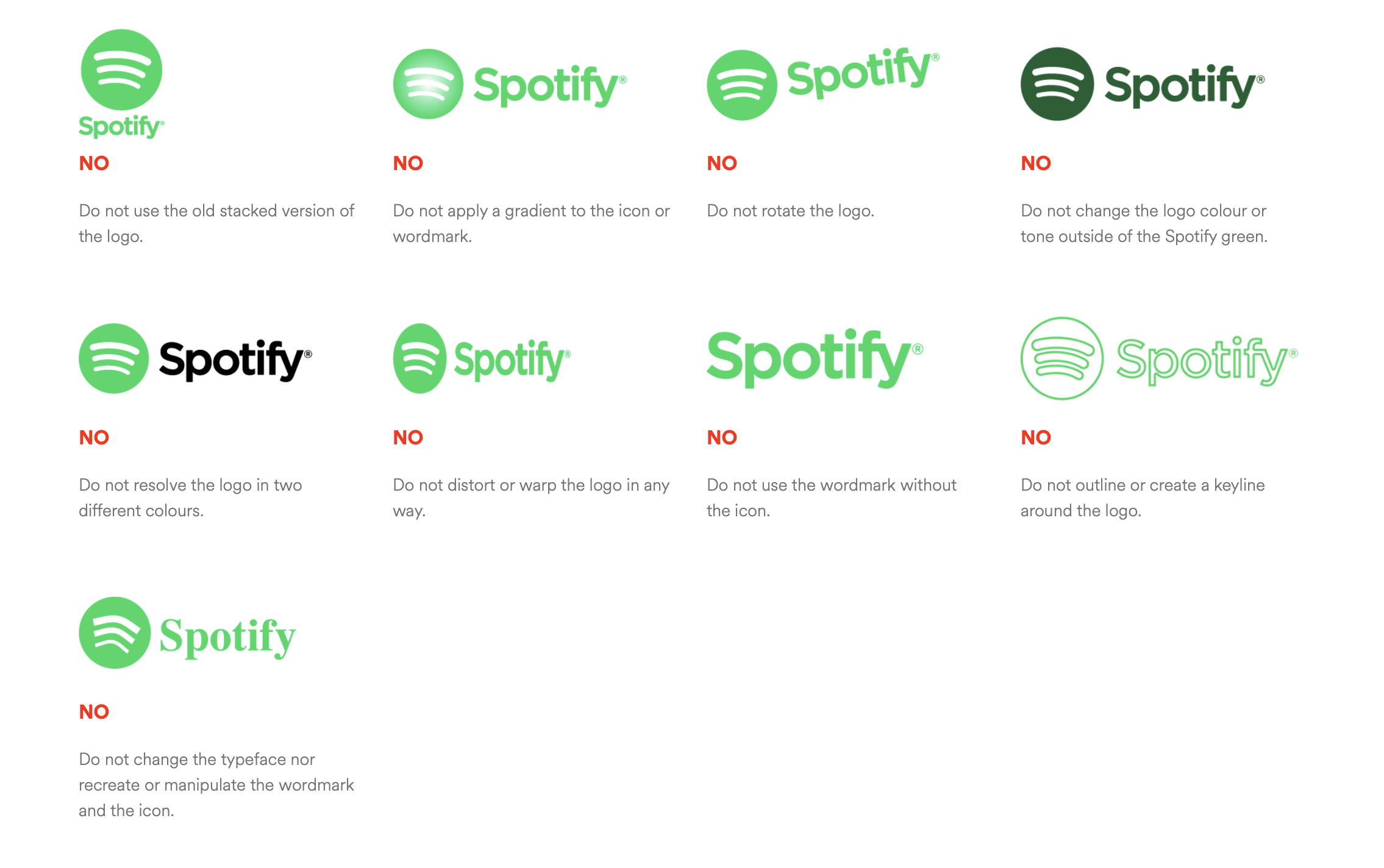
Source: Spotify Branding Guidelines
Typeface Guide
As with the Logo, its necessary to choose your typefaces with a purpose. What is a typeface and what is a font? The typeface is the overall design and feel of lettering, which contains variations like regular, bold, extra bold, italic, condensed, etc. Each variation is a font.
The uses of typefaces vary greatly. Perhaps, one font should be used on all headers, others for the body text. Scenarios such as these and others can be documented in this section of the Style Guide. As a general practice, It is important to choose a typeface different than the one used on your logo so that it will stand out. This means outlining what typefaces are used for what purposes (in print and on the web). Generally speaking, no more than four typefaces, plus an icon/emoji-wingding typeface should be used within a publication, regardless of medium, excluding the typeface used within the logo and its variations. As such, one typeface should be used for headings, captions, figures, citations etc.; one for the body text, one for asides, and one for call outs or block quotes. For online publications, due to oddities of the human eye, its tracking ability, and illuminated screens, serif typefaces are better for first category and non-serif typefaces for most everything else. The icon/emoji-wingding typeface should be chosen so as not to clash with the other set ones. For typefaces that may be used everywhere, a review of Google Fonts is recommended.
As seen below, Twitter and Snapchat have both kept it simple, each choosing one font to use for pretty much everything:
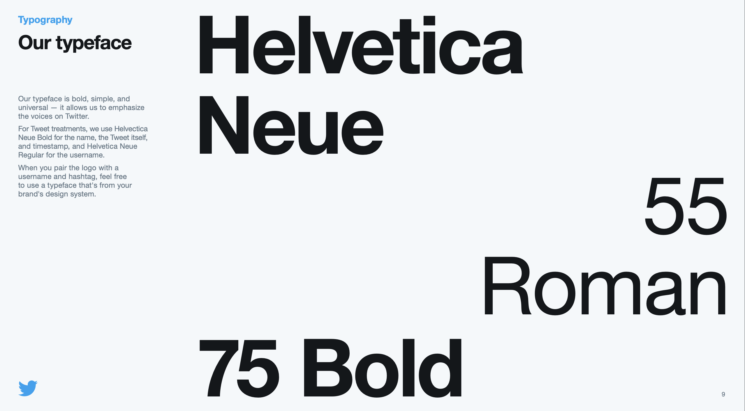
Source: Twitter Brand Guidelines
Digital Guidelines
In this day and age, most organizations’ key target medium is the Internet or, more precisely, the World Wide Web. Consequently, website, newsletters, and social media channels need to share the same branding across all platforms. This branding should be easily understood, accessible and inviting.
When developing for the web, the design mantra should be inclusive design, which means making edge cases central to the design process, which means identifying what may be exclusionary and resolving it, as well as taking what is learnt and applying it to all. In a built environment, an example is the curb-cut at crosswalks that not only make it easier for someone in a wheelchair to cross a street, but also people with perambulators and rolling luggage. In a website, it is an alt tag on an image or a tooltip on an acronym.
These tenets take center stages in the digital guidelines, especially how to implement accessibility features.
Examples of great digital style guides would be Apple, Google, Starbucks and others:

Source: Material Design Guidelines |
 Source: Atlassian Guidelines |
Print Guidelines
As with digital guidelines, print guidelines are crucial for the development of mature Style Guides. Print guidelines refer more to physical mediums, such as letters, invoices and stationaries. In some cases, this section may overlap with your digital guidelines in instances such as when invoices are sent via PDF.
It should be noted that PDF publications would fall under the digital guidelines and would need to be accessible also.
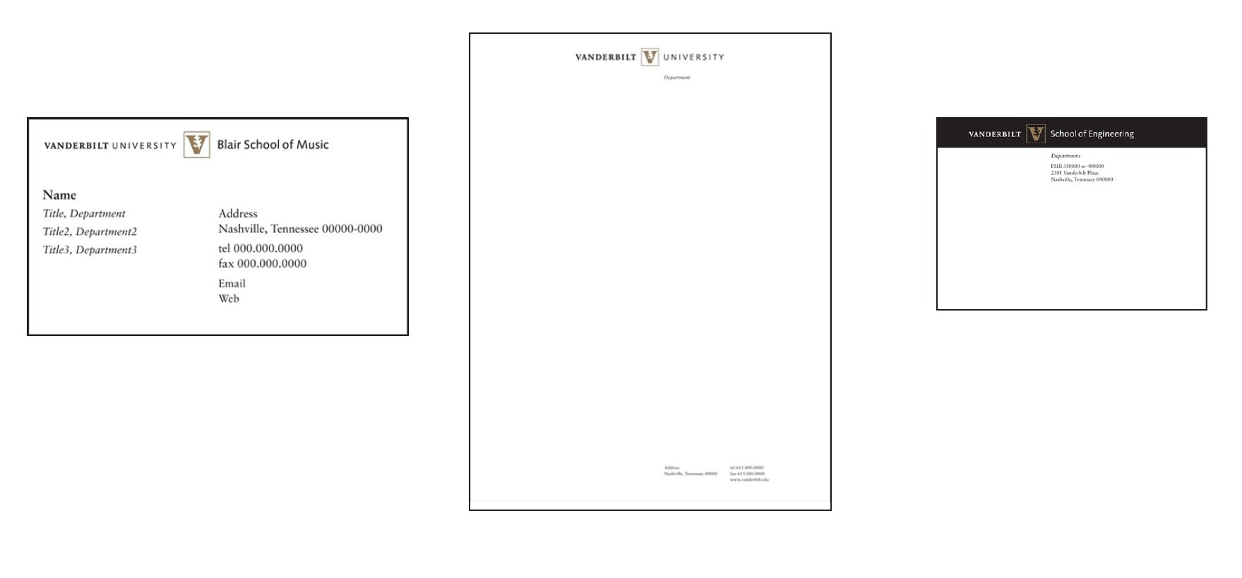
Source: Vanderbilt University Style Guide
In Closing
A Style Guide is a living document. As your organization grows, your organization’s brand will also grow and evolve over time. This growth or evolution should be reflected in your organization’s Style Guide. While change is inevitable, it is ill advised to make frequent radical changes to your company’s visual components. As always, an organization should always keep an eye open for feedback from its audience. If something is not working, you should plan adjustments accordingly. The Style Guide, if maintained and utilized properly, is an invaluable tool for standardizing communication with the public, minimizing mis-communication and enhancing your organization’s reputation.